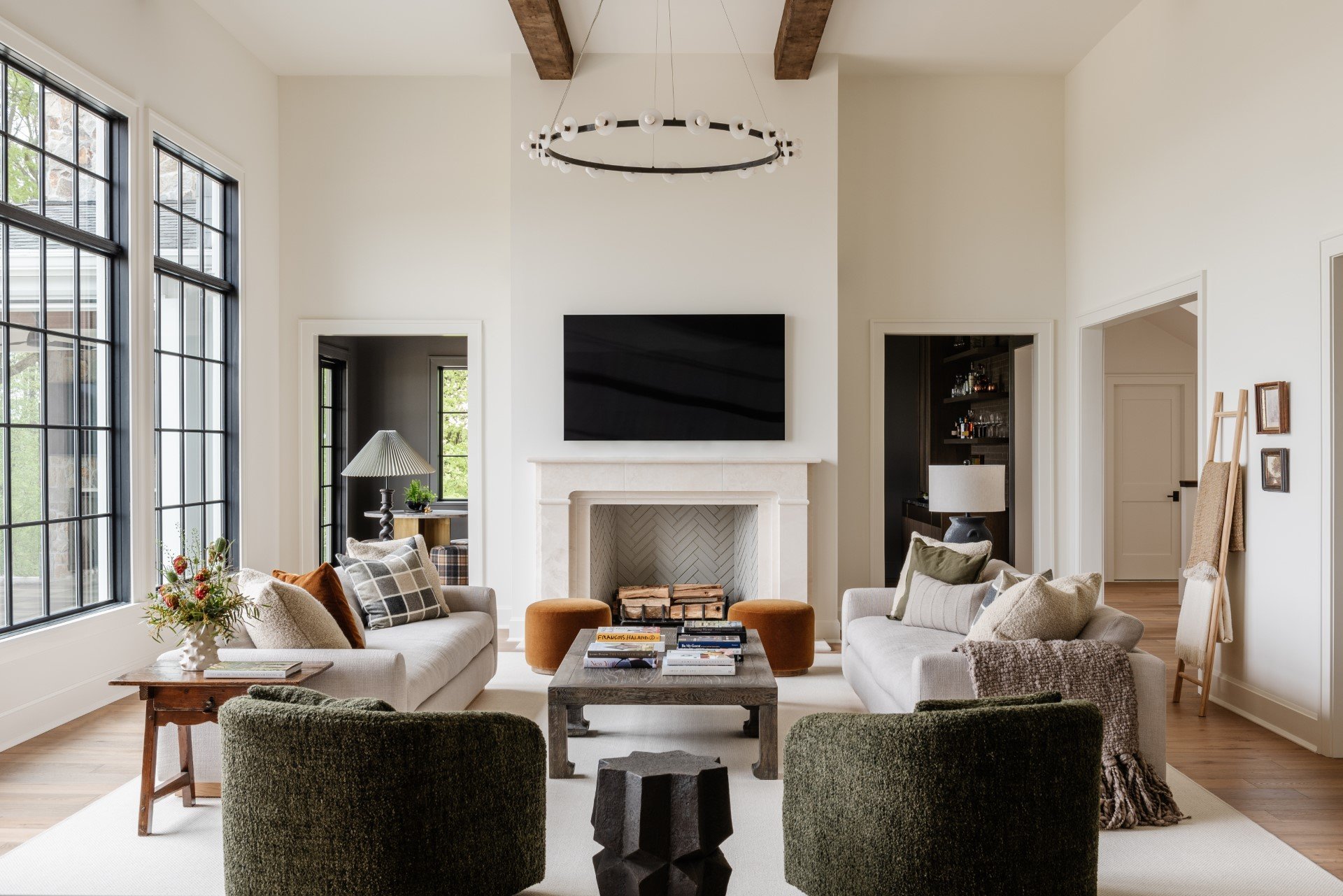
Three Things Interior Designers Should Consider When Investing In Photography for Their Design Portfolio with Photographer Linda Pordon
Credit: Linda Pordon for Heidi Woodman Interiors
Welcome back to another edition of Dakota Design Company’s Guest Expert Interview series here on the blog. We’re so thrilled to share expertise from female business owners and leaders that run the gamut of the interior design industry – from interior photographers, to social media moguls, financial advisors, and branding experts.
Each of our expert guests were selected because they can share their unique insights and perspective on a range of topics that will help any interior designer take their trade and business to the next level. These experts are Dakota Design Company insiders, and many of them have worked directly with us and our clients in the past. We hope you enjoy this series and that it brings you new insights, tips, and tricks to add to your interior design toolbox!
–
This week, we asked interiors photographer Linda Pordon to share three things photographers wish designers knew, and what to consider when investing in interior photography for your design portfolio.
Linda is a recognized interiors photographer based out of the New York/New Jersey area. Her work has been published in outlets including Better Homes and Gardens, Domino, Elle Decor, and the NY Times.
In addition to her photography work, Linda is a tenured corporate executive, most notably as a Vice President of marketing and strategy at American Express where she was focused on customer needs in the luxury marketspace. She uniquely draws on her 20 years in corporate to optimally translate the visions and stories of her interior design clients.
Through her photography, Linda aims to convey the feel and depth of the spaces she photographs but, more importantly, she aims to create lasting emotional connections to the designers and brands behind these spaces.
Here’s Linda’s advice on working with a photographer and making the most of your interior photography.
What are three things that interior designers should consider when investing in interior photography for their design portfolios?
01 | Create one cohesive visual narrative; The visual images of your work should feel like one connected story.
I'm not suggesting every designer has a goal of authoring a coffee table book of their projects, but IF you did, there should be a similar look and feel to the photography. Keeping with the book analogy, it's like having different narrators writing one chapter each in a book– it will be choppy. There will be highs and lows and downright bad writing and your reader may be left confused.
Hiring several (or many) photographers with different styles and experience levels may come with some benefits (i.e. the ability to hire locally across geographic markets, managing a project with a smaller profit margin, more booking availability, etc.).
BUT, if you can find one photographer or a small subset of similar creatives who understand how to best translate your work - that will create the most beautiful portfolio to help your clients understand your aesthetic and your brand best.
02 | Quality > Quantity; Don’t water-down your brand for more content.
The age old adage of “less is more” rings true here. Quality of imagery is so much more important than quantity
This goes for both 1) what to photograph and 2) what to capture on shoot day. Interior photography is an investment and there’s a reason for that. Equipment is expensive, shoot days are long, and post-production time and expertise even more so. So how do you know what to photograph? Chances are if you’re debating if it’s worth it and asking your photographer “do you think we should” or you want “some quick and cheap shots” or you “only did some of the space”– it’s better off not to (unless you were just playing coy, you humble little thing).
Capturing images that don’t fully represent your work can be more damaging than helpful as you market to new clients. Professionally photograph what you LOVE. What you are PROUD of. And what you WANT MORE OF. Nothing less.
Now…what to capture when you are at a shoot?
The same rule applies here. I find it most helpful when we are thoughtful in our shot list for a space. It is better to walk away with more of THE BEST shots (great composition, great light, really showcasing the most beautiful rooms or details) than when our goal is to get as many images as possible. Take the time to style (and restyle) as necessary.
No matter how gorgeous a space is, if it lacks proper styling (for the camera – which is not always how your eye sees things), it is never going to look like an elevated magazine feature. Take your time with each shot. Get the composition, lighting, and styling perfect and that will be an image you will want to share again and again.
You don’t need 10 photos of a kitchen when a few stunning images will impress. Also, trust your photographer here. A good interior photographer will tell you when a shot is falling flat or when there’s an unexpected space or angle that will translate beautifully on camera.
03 | Be clear on usage and goals for your imagery. Make the most impact for your investment.
Take time to think through how you want to use your images – what is your end goal? Are these being used locally to attract clients in local print/online publications? Do you want a national print feature? Do you need content to create/refresh your website? Do you need more imagery of yourself and your brand? More social content? All of the above?
No, that is not the right answer! Well, not for one shoot!
Answering these questions will help better set the scope of your photo shoots and optimize how and when to invest in professional photography.
If a designer isn't quite ready to invest in interiors photography, what are two things they should do to start on the right foot?
01 | Take the time to hone who you are as a brand so you have a real story and voice when you DO have that glossy content.
Are you playful and funny? Are you a thought leader in your respective space? Are you bold and wild or are you calming and relaxed?
Try to choose one sentence to describe your brand and then 3 key things you want people to know. Having this framework in place will help you know what to say (and how to say it) when you’re sharing content across all channels.
02 | Start small. Literally.
You may not have perfectly shot interior photos but what you do have is plenty of gorgeous details. Use some outdoor lighting (or details near good natural light) and grab those fabric samples, flat lays, hardware detail, etc.
This is the library of options clients are hiring you to know where to source and they love seeing it. Just NEVER shoot with overhead lights on and try to make sure you are holding your phone straight. You’ve got this!
–
Looking for more? Keep reading:


